Management by Emotions: The “Artist” Inside Me by Carlos M. Rodriguez, Ph.D. Contributing Writer Business organizations around the world strive for profitability, growth, and sustainability. Several challenges faced by businesses include the lack of a...
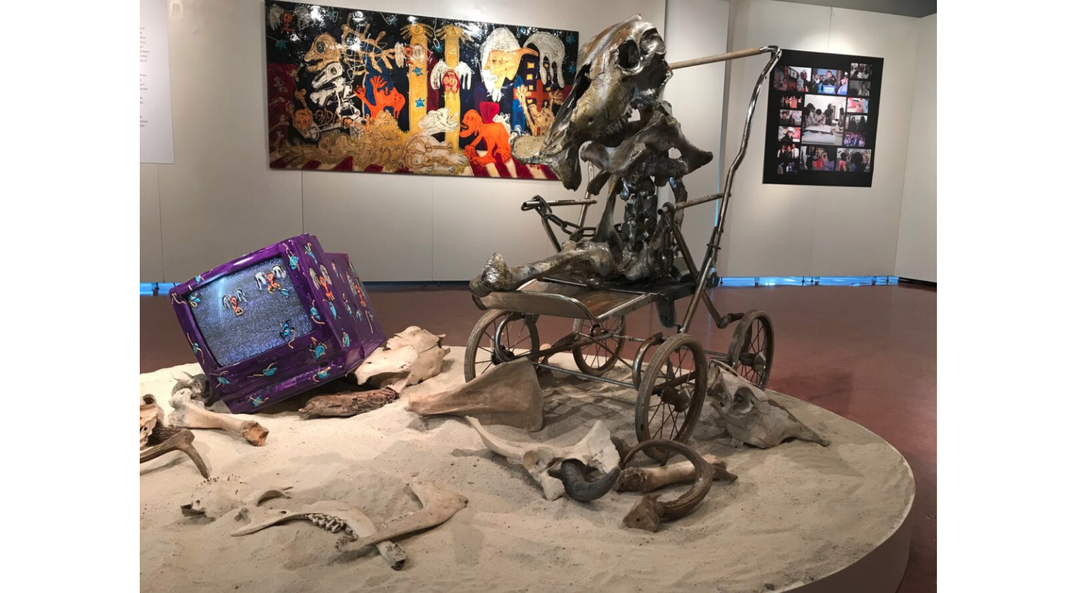
*** Baby, it’s on you by Mike Foldes Review I had a chance recently to visit the Karl and Helen Burger Gallery at Kean University in Union, New Jersey, where Brazilian-American artist and cultural activist Duda Penteado has a solo show running through to...
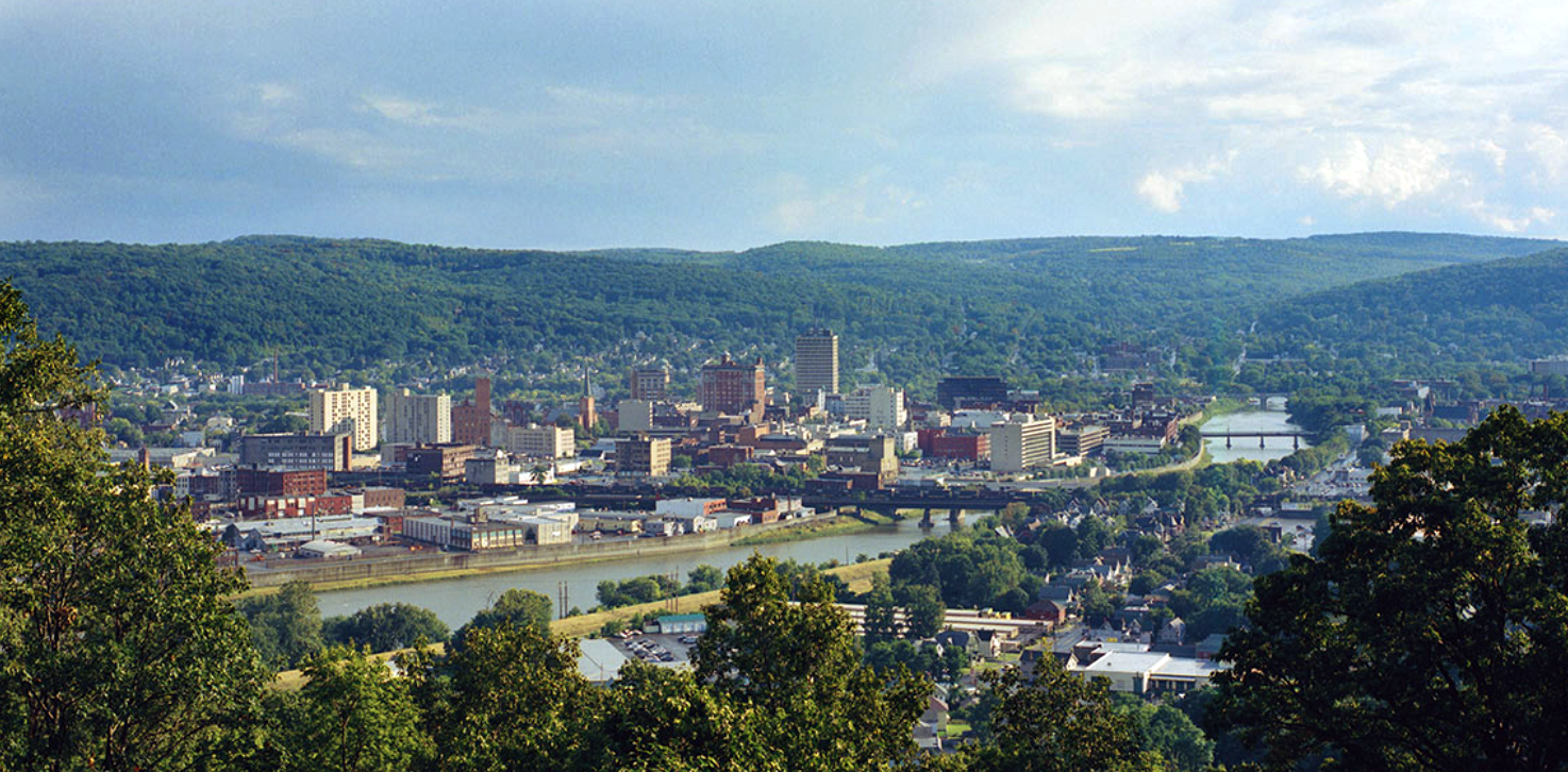
Binghamton Visitor Bureau Photo *** Our Back Yard The Earth is rich with treasure. We are fortunate to have had the opportunity to mine a bit, and time and again to have hit pay dirt. In addition to the people whose works appear in the links below, there are...
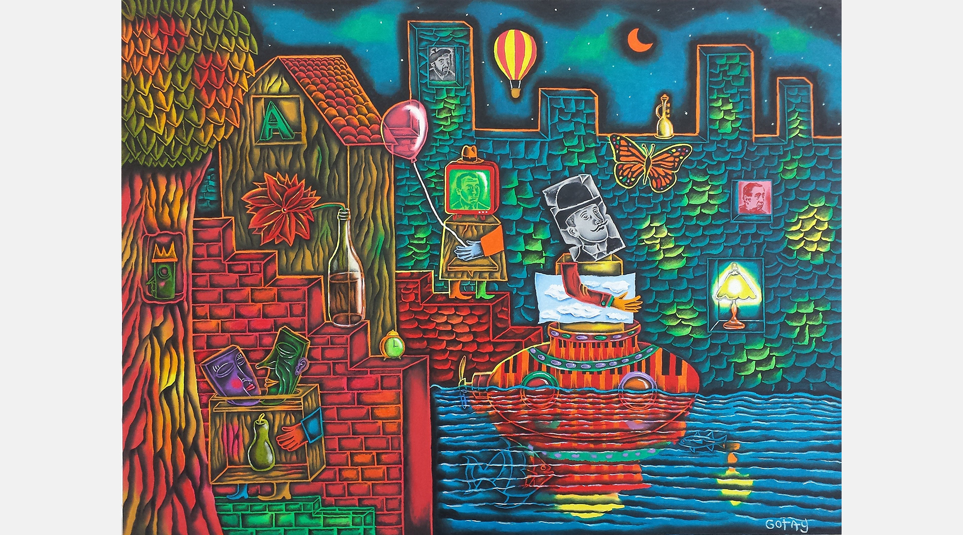
SUBMARINE The art of Jules Gotay Language & Perception: Making the Connection CARNIVAL Artist’s statement: My paintings live on the border between language and the physical world. They exist in the place where ideas become...
Updated approximately six times a year, is a collaboration of emerging and established artists, writers, poets, musicians, photographers, travelers and interested others, with a goal to promote an eclectic selection of subject matter to an international audience. Please carefully read submission guidelines before sending material.
The name Ragazine was coined in the mid-’70s in Columbus, Ohio, as the title of an alternative newspaper/magazine put together by a group of friends. It was revived in 2004 as ragazine.cc, the on-line magazine of arts, information and entertainment, a collaboration of artists, writers, poets, photographers, travelers and interested others. And that’s what it still is.
Recent Comments